I often have a hard time explaining to friends and family what exactly INTViewer does. The moment I use the word “seismic,” the listener’s mind automatically shifts to the topics of seismic activity and earthquakes, and I need to explain oil & gas exploration technologies before I even get to the software. By then, I have lost my audience.
Today, I’ll try a different technique: I’ll describe the capabilities of INTViewer that actually cater to earthquake mapping. I will show how you can use the built-in capabilities of INTViewer to map recent earthquake activities.
To prepare for this blog article, I needed data. The United States Geological Survey (USGS) provides recent earthquake data on their website.
This data is provided in QuakeML format. INTViewer has a free plugin called Microseismic that opens QuakeML files directly. In this example, I downloaded the “All Earthquakes” QuakeML file for the past 30 days (all_month.quakeml), it opened right away, and after a few clicks, I got the visualization below:
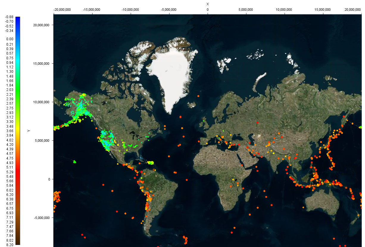
Map is provided by Bing Maps
Data is provided by United States Geological Survey (USGS)
The color of each dot identifies the magnitude of each recorded event. I choose Bing Maps to show these events in context, requiring the installation of the free RemoteMap plugin.
There are a few websites proposing similar visualizations, but INTViewer can go further than these websites. For this example, I went to another data source, the International Seismological Centre (ISC) in the UK. This association compiles records of the earth seismicity, and provides a convenient way to search those records.
I decided to map earthquakes in Peru (longitudes from -83° to -65°, latitudes from -3° to -20°), starting from the 1970s to today. In the visualization below, the color and size of each dot identifies the depth of each recorded event.
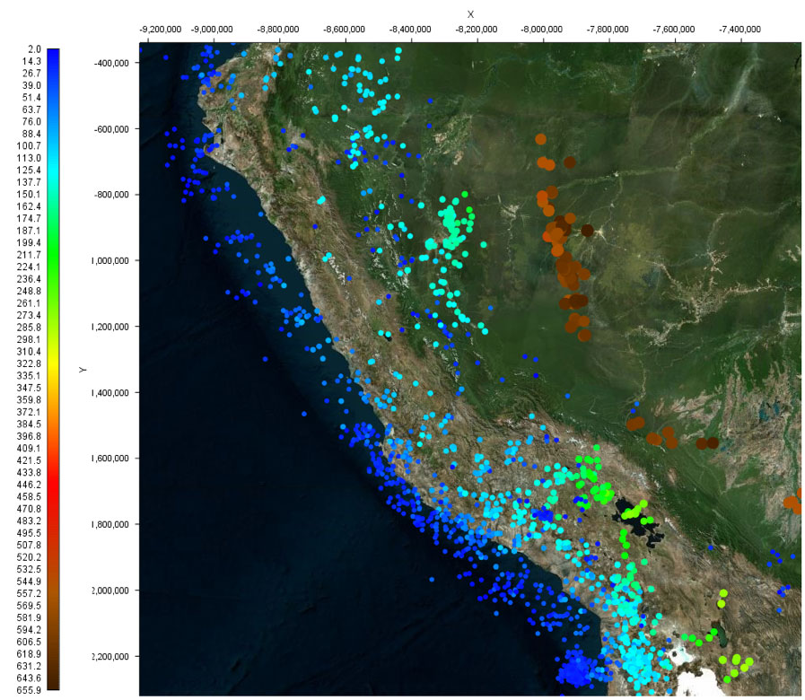
Map is provided by Bing Maps
Data retrieved from the ISC web site:
International Seismological Centre, On-line Bulletin
Seismologists typically use another type of visualization to identify the fault-plane solution, also known as focal mechanism. This mechanism describes the orientation of the fault plane that slipped as well as the slip vector. The colloquial name for this visualization is beachballs. Here are sample beachball representations provided by the Penn-State Geosciences Department:
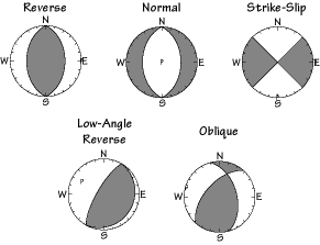
A single beachball describes three attributes of a seismic event: the strike, the dip, and the rake. These three attributes are present in the ISC exports and can be visualized in the form of beachballs in INTViewer. After changing the display options of my Peru session, I got the result below:
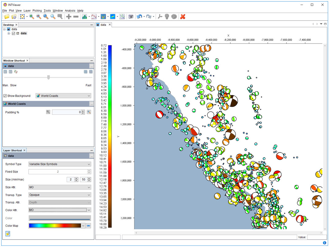
Data retrieved from the ISC web site:
International Seismological Centre, On-line Bulletin
Visualizing nature’s earthquakes is, of course, not a typical use of INTViewer, since most will use it as part of their seismic exploration QA workflow using data from manmade seismic events, but it is an interesting way to demonstrate how it works.
For more information about INTViewer, visit the INTViewer product page, or contact us for a free trial.